Context01 / 04
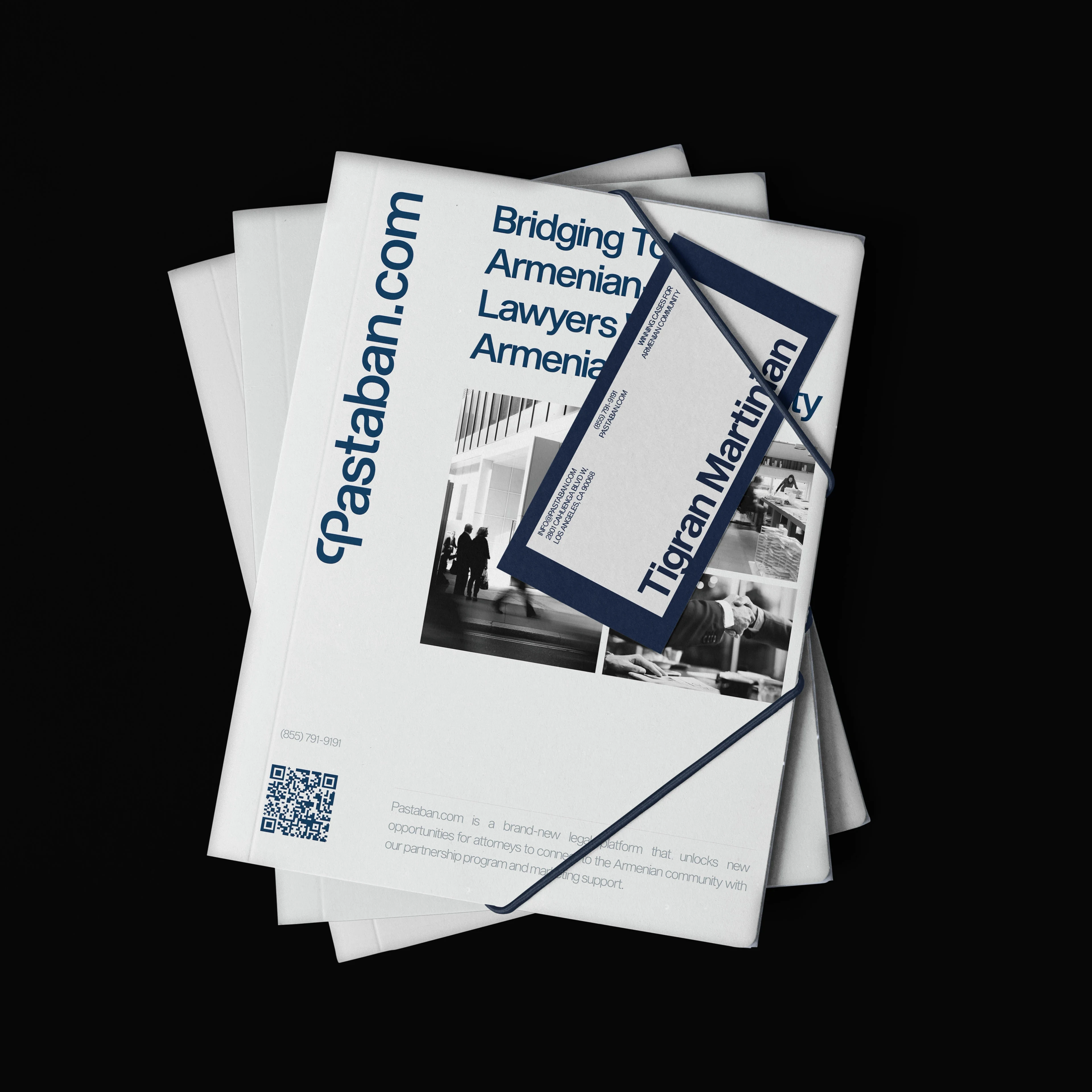
Legal help is built on trust, and trust is hardest to find in an unfamiliar system, in a second language, through scattered referrals. The identity had to hold two forces at once: the credibility of a legal institution and the warmth of belonging to a community.
Idea02 / 04
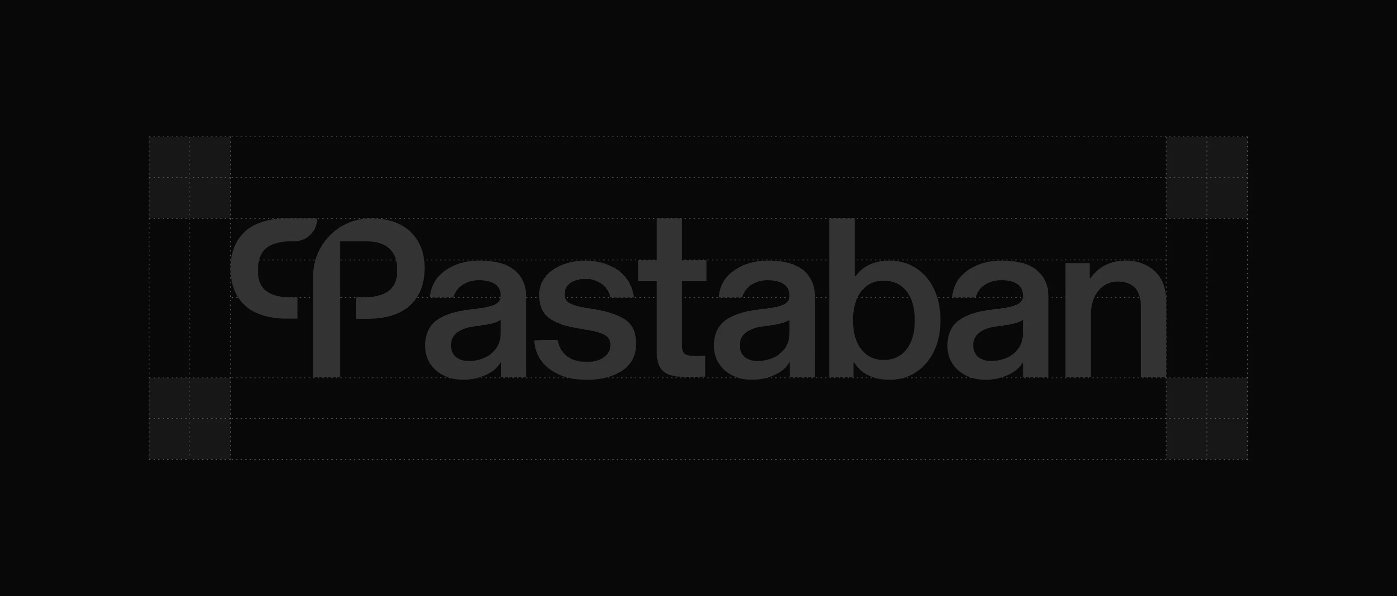
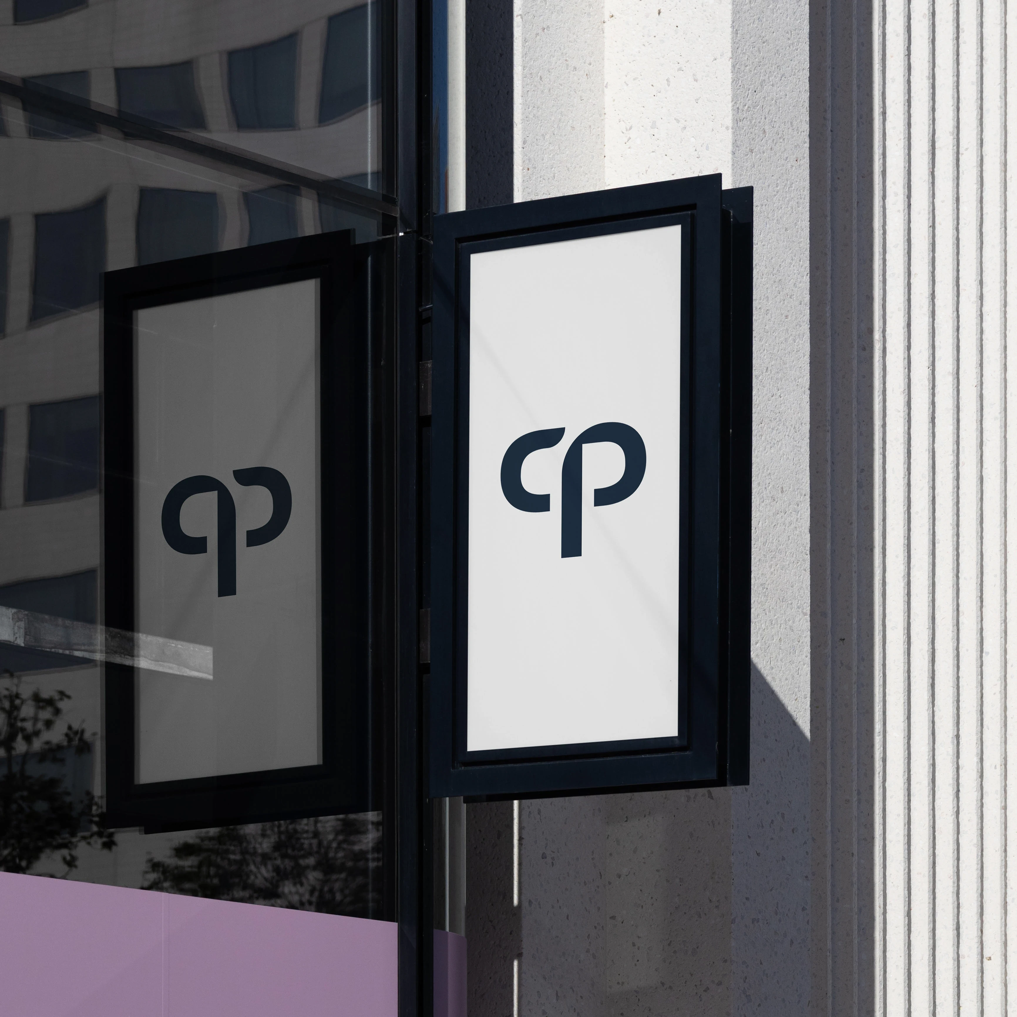
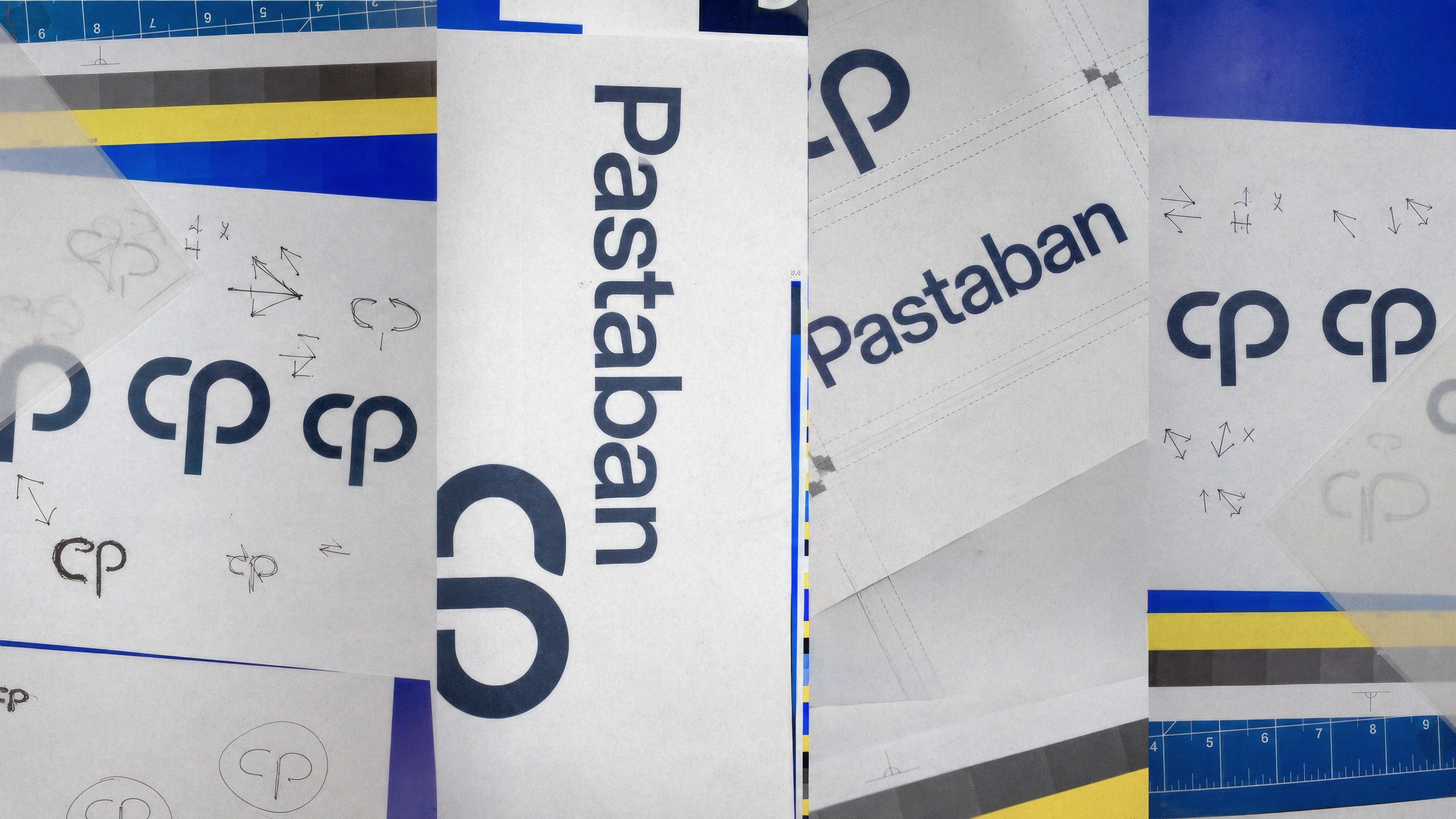
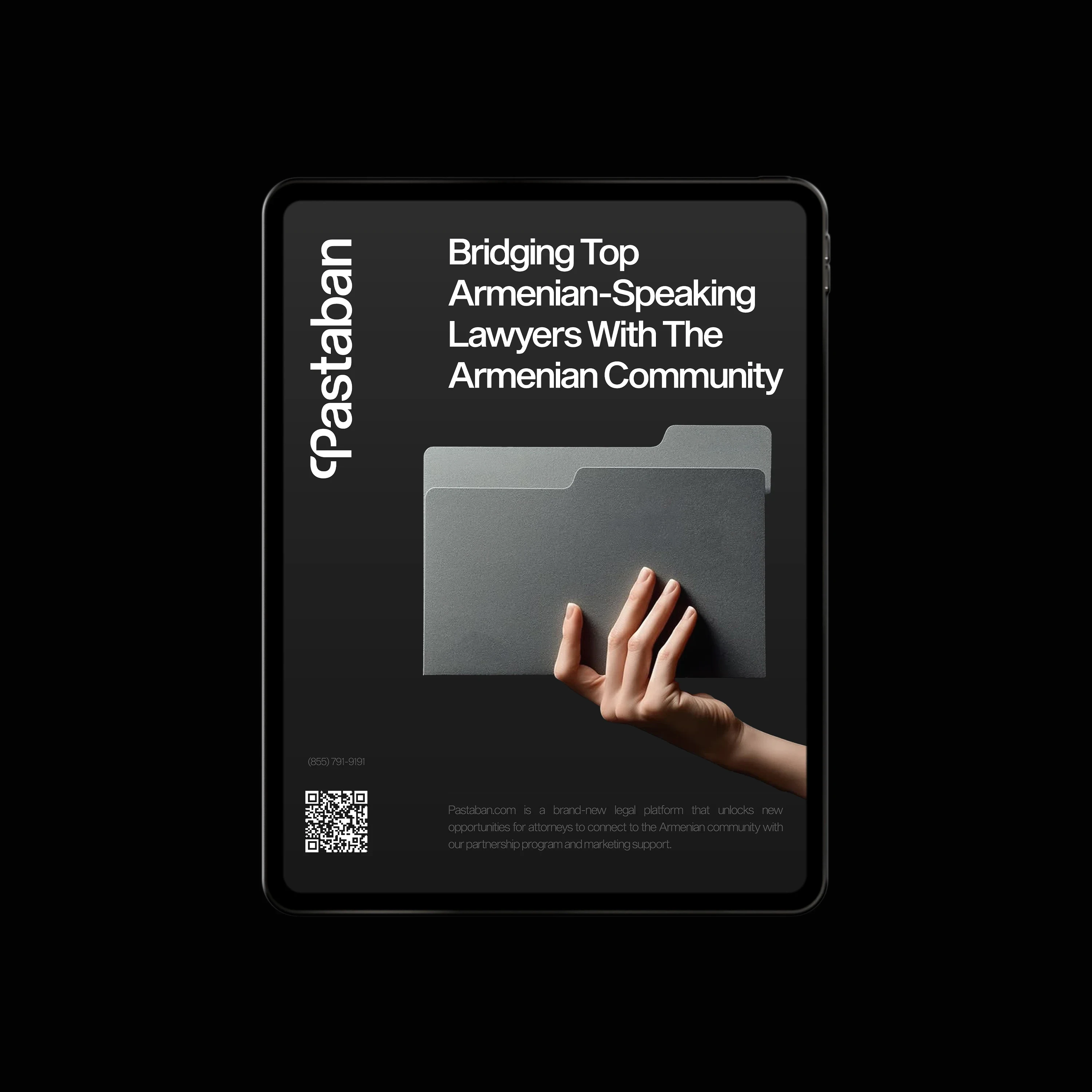
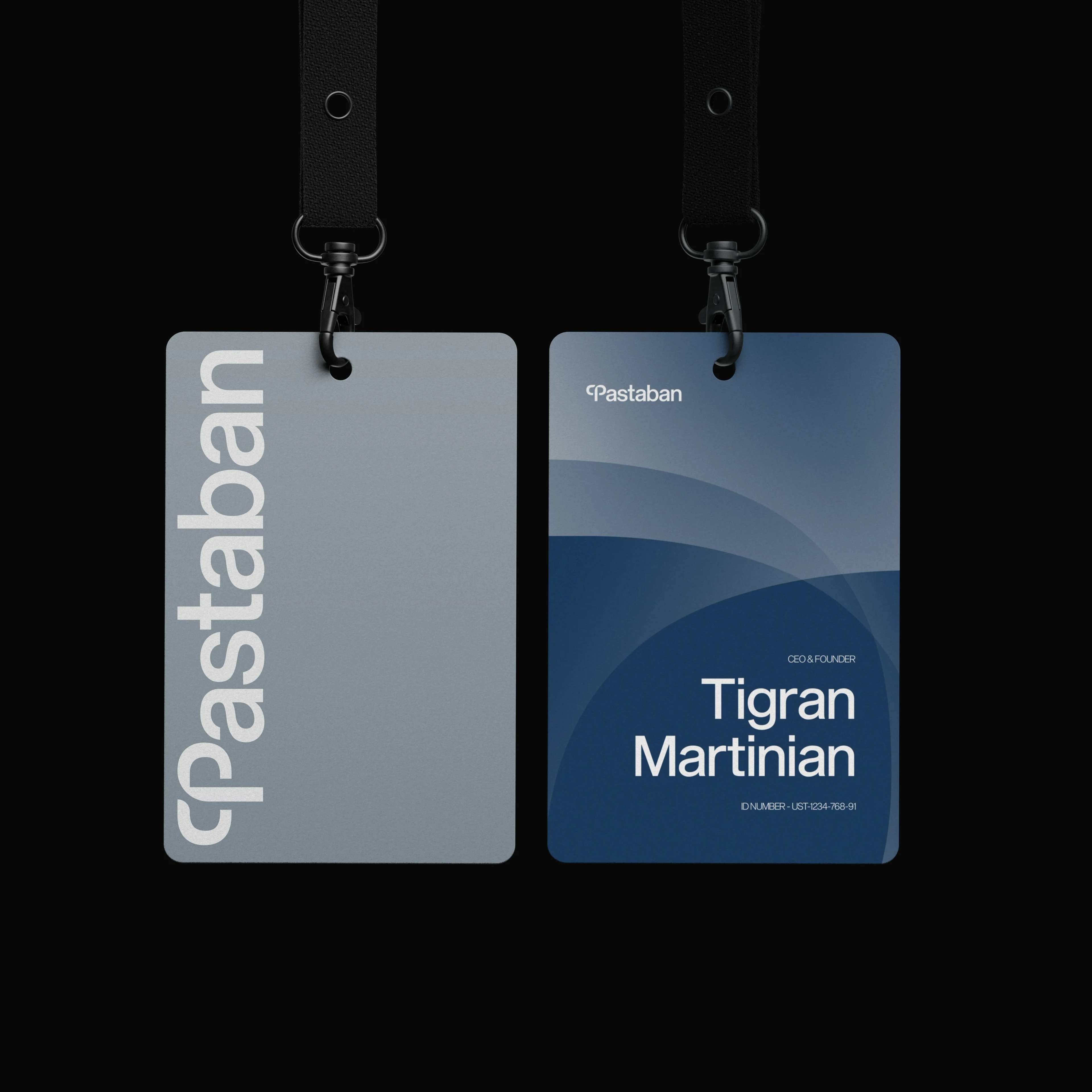
The name already carried the whole brand. Pastaban (փաստաբան) means lawyer in Armenian. The Latin P is replaced by the Armenian Փ — one rounded contour, firm enough to read as an institution, soft enough to read as a hand reaching out.
System03 / 04
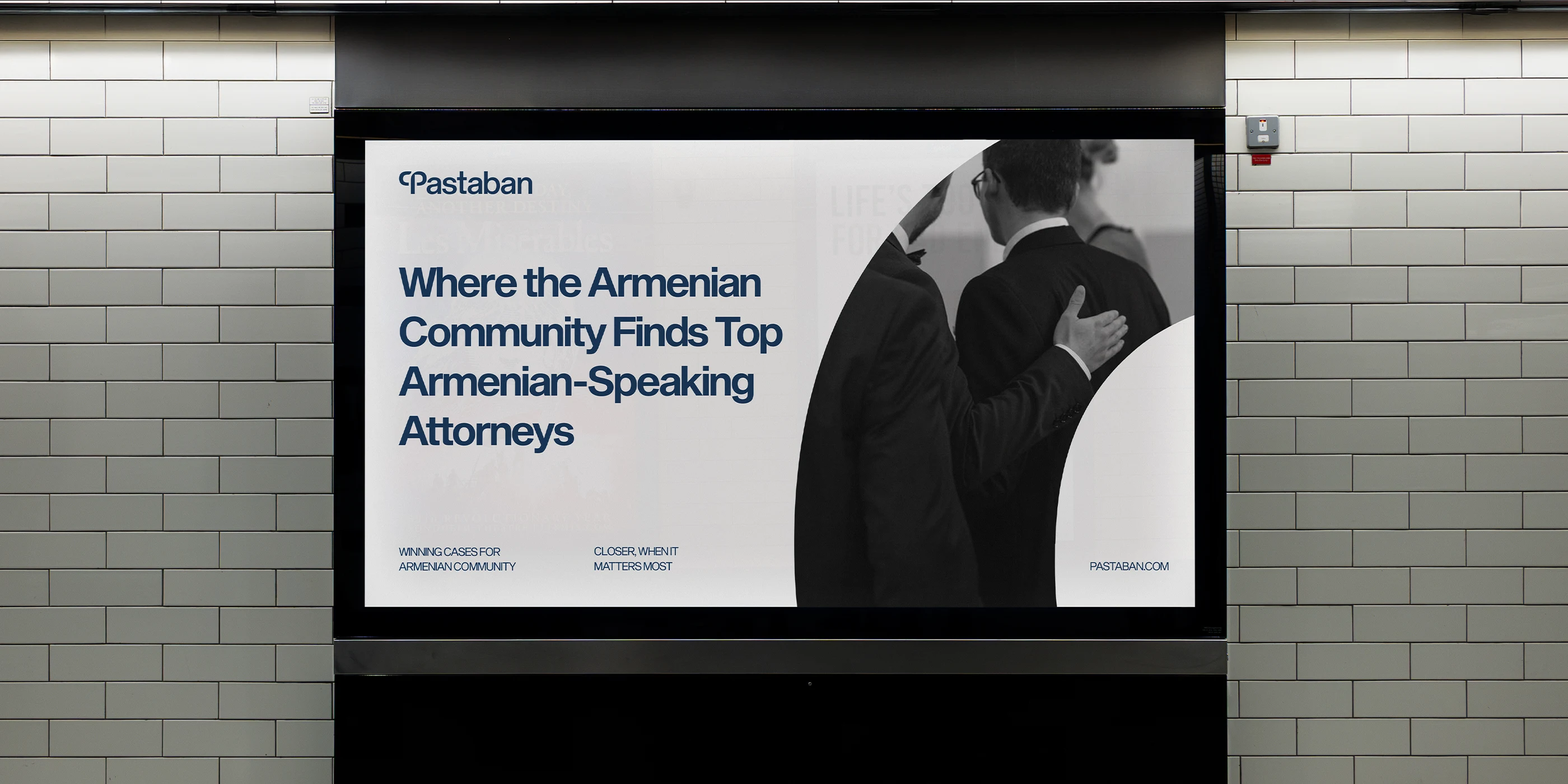
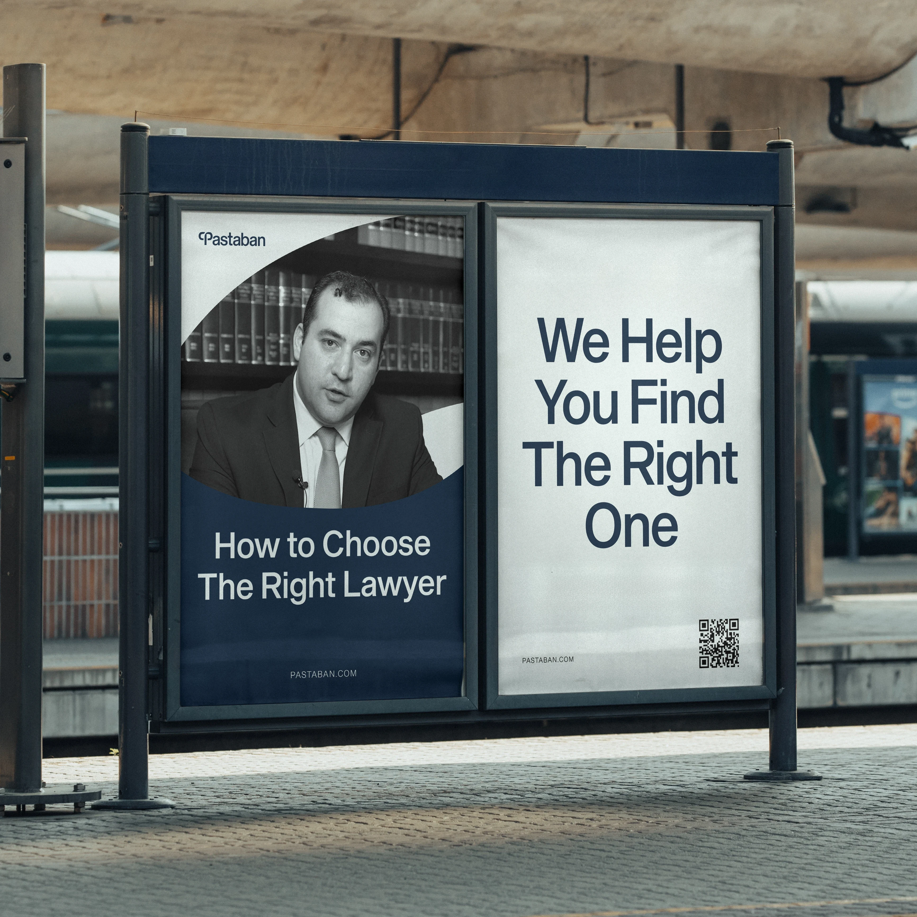
That contour became the DNA of everything that followed: the frames, the photography masks, the rhythm of the layouts. Structured, but not cold.
Typography04 / 04
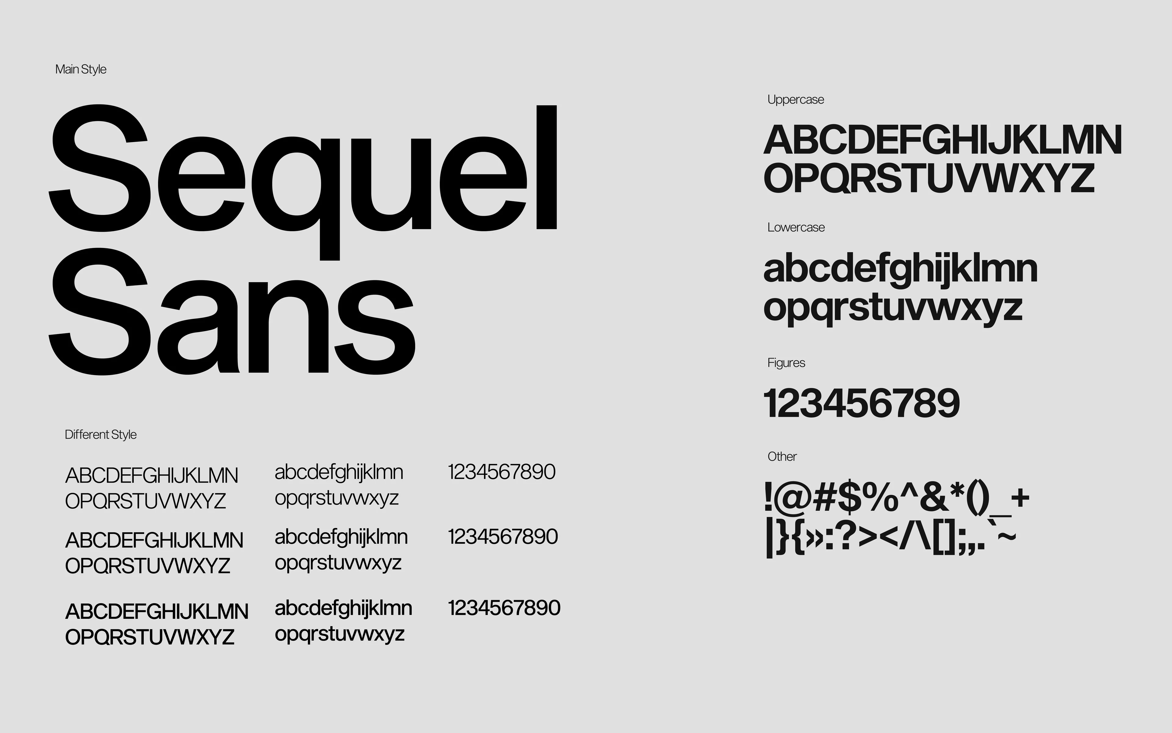
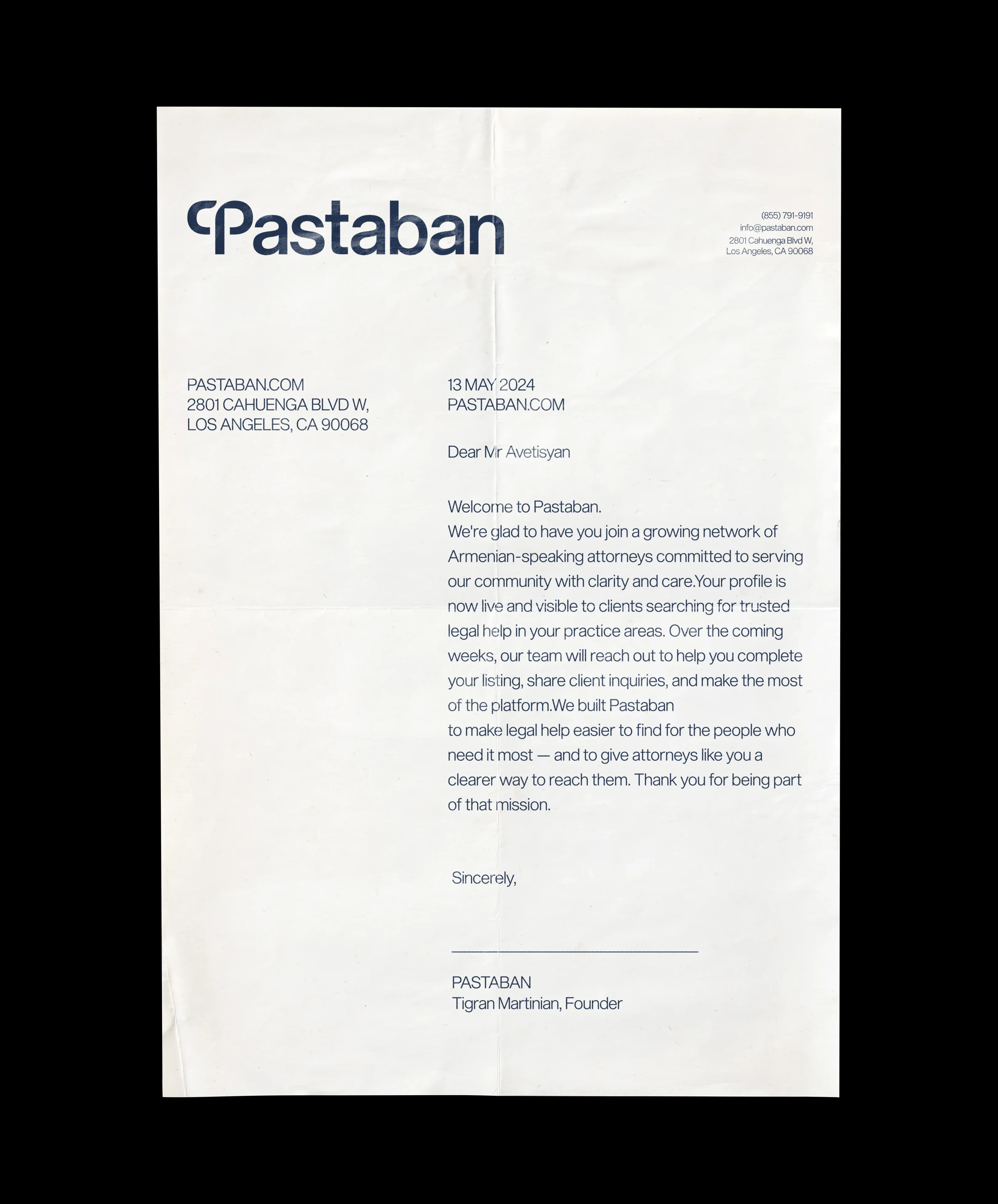
Sequel Sans for Latin, Noto Armenian Sans for Armenian. Both are unambiguous and easy to read, and suggest a bridge between tradition and today's digital landscape. The Armenian face is what lets the brand speak to its community properly.